

You spend all that effort understanding your users, to build empathy, and to create workflows that genuinely tackle their problems. So, why is it that when it comes to showcasing your own UX portfolio, you seem to forget all that knowledge about user-centered design?
Why do so many designers end up crafting portfolios that cater to themselves instead of the very people who will be reviewing them?
And worse, why copy someone else’s story, tone, and aesthetic when you have your own? Are we in the business of crafting unique experiences or replicating what’s trendy on Behance?
Every time I come across a generic portfolio, the kind that feels like a copy-paste job from Dribbble, two things are clear:
- You haven’t nailed your personal brand.
- You’re more committed to following “process” than understanding context. It shows in the way you create deliverables without checking if they even make sense to your stakeholders.
After reviewing 1,000+ portfolios in the last 13 years, I’ve spotted a pattern. The best ones aren’t just pretty, they’re intentional. And while some of this might feel harsh, I promise it’ll help you build a portfolio that actually gets attention from the right people. If you’re looking to rebuild a UX portfolio that genuinely stands out, it’s not about flashy visuals or trendy layouts.
Let’s get into it.
First: Know Who You’re Talking To
Before you open Figma, ask yourself, who’s actually going to read this?
Placement Partners
Third-party folks who help companies hire. Some know UX deeply. Others… not so much. They’re scanning for potential matches, not dissecting every screen you designed.
HR Recruiters
- Juggling 20 roles at once
- Prioritize frictionless hires
- Usually work with ATS and pre-vetted pools
- Can be your advocate but rarely the final decision-maker
- Care about timelines and quotas
Hiring Managers
Now we’re talking design managers, product leads, heads of tech, or marketing folks. Some know UX like the back of their hand. Others have no clue what a wireframe is. Your portfolio needs to be clear and scannable for all of them, whether they’ve got a surface-level understanding of UX or decades of experience.
The best portfolios speak both languages: clear and quantified for the non-designers, deep and strategic for the UX pros.
The 3 Golden Rules of Portfolio Building
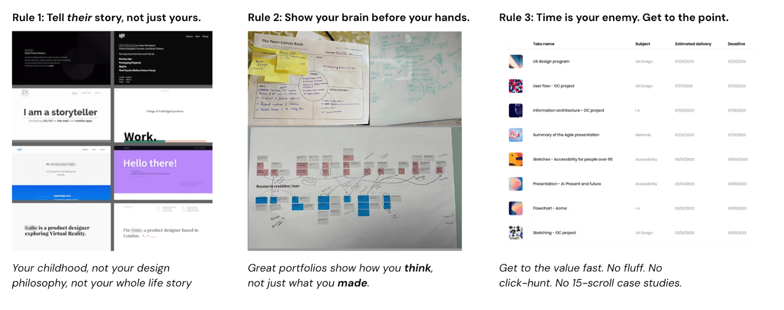
Rule 1: It’s Not a Therapy Session
This isn’t a TED Talk about your trauma. Your origin story doesn’t need to take center stage. Keep the spotlight on what recruiters want to know:
- How did you set and achieve goals?
- How did you collaborate?
- How did you back decisions with data?
- How did you challenge assumptions?
Save the personal monologue for your blog.
Rule 2: Show the Mess
Every good design story starts messy, with confusion, uncertainty, bad sketches, and conflicting opinions. Don’t hide it. Use it. Your ability to navigate that mess is what makes you valuable.
Your portfolio isn’t just about pretty final screens, it’s about how you got there and what impact it made.
Rule 3: Time is Your Enemy
More ≠ better. If you send 25 projects, it screams, “I don’t know how to prioritize.” Pick 2–3 of your strongest case studies. Make every slide count. Less clutter = more clarity.
Remember
The Portfolio Structure That Works
This is not a template. It’s a guide. If you follow it blindly without adapting it to your project’s context, you’re missing the point.
- Problem Identification
Start with the real problem. Not what your stakeholder said in the brief, but what’s broken for users or the business. What made this worth solving? - Strategy & Process Setup
Did you jump into research, or did you first understand how this problem connects to the larger business or system? Outline your plan: goals, timelines, risks, research scope, and success criteria. - Collaboration & Goal Clarity
Experience design doesn’t happen in isolation. Who did you collaborate with? How did you align goals across teams? - Research & Insights
What gaps did you need to fill? What research did you conduct? How did you justify the budget and timeline? What insights changed the direction of the project? - Information Architecture & Flows
Or any other data modeling method. Why did you choose this approach? How did it shape shared understanding and move the project forward? - Ideation & Wireframes
How did you decide? What options did you explore? How did you decide what to build, and how did you validate your ideas before jumping into UI? - Decision-Making & Tradeoffs
You’re not just a designer, you’re a problem-solver. What tradeoffs did you make? How did you lead decision-making while balancing team input? - Stakeholder Communication
How did you manage communication? What did you share, how often, and in what form? - Impact & Outcomes
What changed after your work? How did you measure success in metrics, business value, user sentiment, or team alignment?
A portfolio is not simply a collection of deliverables. It represents how you think, your collaborative process, and how you generate outcomes. Whether you’re self-taught or coming from a UX design course, the more real, strategic, and story-based your portfolio is, the more it will stand out.
Build for the reader. Use your voice. And for god’s sake, stop copying those Dribbble case studies.